
So I am sneaking in here for just a quick minute to drop a couple of cards before I run out for a birthday lunch. I might have missed a minute of time management, but I am going to sneak this one in if I can.
 In my quest to find a few new challenges, I a ran across a fun CAS group by the name of Less Is More that promotes a very true CAS challenge group. We all know that I am not so good at CAS and have a desire to be better at it, so I thought I would give this group a go. This challenge the design team is looking for cards that have a color scheme of turquoise and lilac.
I pulled out a great little stamp pack from Neat and Tangled, and 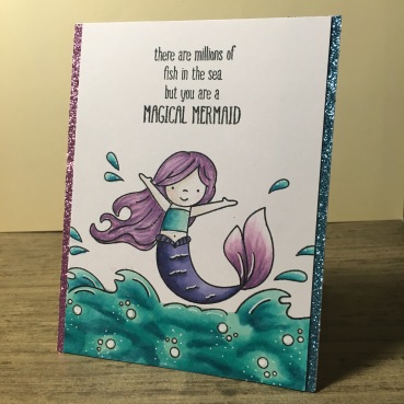 stamped out a simple scene onto the card stock. I then colored in the images with just ten copic markers using three for the turquoise and six of them for two different shades of lilac. My mermaid needed two different shades of lilac to make her more interesting. Finally, I added just one pale shade of peach to the mermaid’s skin so that she wouldn’t blend into the white. Then I pulled out my white gel pen and highlighted certain areas of the card. I also grabbed my glitter gel pen (see I’m really not good at CAS) and highlighted areas of the mermaid and the sentiment. Finally I snagged some purple and turquoise glitter paper and added it to the sides of my card stock so that I could really add a bit of ‘magic’ to the card. I know this really isn’t super CAS, but she is so cute.
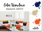 The gurus of color over at Color Throwdown this week have a really fun color challenge up this week. This week they are looking for navy blue, kraft, orange, and white.
I wanted something a little fun to play with, so I pulled out an Art 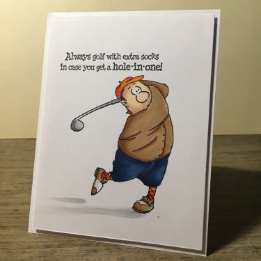 Impressions stamp and stamped him out onto some card stock along with the sentiment from the same stamp pack.. I then colored him in with my copics trying a new color combination that would make the perfect kraft color. The orange didn’t pop as much as I wanted it to, but I figured the coloring worked since only golfers can dress like this and look cute. I added some simple shading under the figure and trimmed up the card stock. I added it to the A2 card base with some dimensional tape and left the card that simple. I love the coloring, but I find the card too simple. But since I am holding this card for a guy, I guess simple is better than too over girly done.
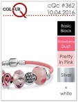 The queens over color of at Colour Q this week have a breast cancer awareness challenge going on this week. Since I have lost too many friends to this awful disease, and watched even more fight it, this is a month of awareness I feel particularly towards. I even carry a bubble gum pink purse all month, and I am not a bubble gum pink girl. Weirdly, I don’t have any stamping products that are awareness type stamps, so I
  had to get a little creative about it.
I pulled out a really cute super girl stamp from CC Designs and a cute, cute, cute stamp from Riley and Company Funny Bones and stamped them onto a bit of card stock. Then using just a pencil, I free handed an awareness ribbon onto the card. I colored in my image using the two shades of pink in the challenge with my copics, along with the black in her hair (along with a blue copic to help highlight the hair). Then using a bit of Distress Spray in silver, I painted in the tunic and the stairs on her tiara to add the silver in the challenge. I trimmed up the card stock and added some soft pink printed paper under everything. I hate this awful disease and pray regularly for those who have been affected by it, be it the patient or the ones who love them. I know science has come a long way in treating this stupid disease, but I pray it comes even further so no one has to know the suffering of it. For anyone out there fighting, just keep fighting and know that you are in my prayers.
That’s all for today. I know it was a quick post, but I hope that you enjoyed the bits of little art. Till next time….

WOW! you have been busy here with 3 fantastic cards, superb colouring, images and designs on each and I’m loving your take on the lilac and turquoise challenge! Great to see you found our CAS challenge blog and thanks so much for playing along with us at Less is More this week. Sarah
LikeLiked by 1 person
Love, love, love your gorgeous CAS creations! They all look great, and your use of turquoise and lilac for our colour challenge at Less is More is so pretty. The sparkly edges are a super finishing touch. Thanks so much for playing along with us and I hope we’ll see you again soon 🙂
LikeLiked by 1 person
Wow, you have been busy. Your cards are lovely. I like how you added the glitter to the sides, adds a nice sparkle to your card. Thanks for sharing at Less is More!
LikeLiked by 1 person
So glad you found our challenge. I don’t think you have a problem with CAS at all! All three of these are great. Your mermaid card is perfect for our colour challenge and you’ve left some all important white space which we love!
Thanks for sharing with us.
Anita x
Less is More
LikeLiked by 1 person
Love your wonderful array of cards today. Especially clever is your last card. Love that little hero. Thanks so much for playing along at ColourQ this week.
LikeLiked by 1 person
These are fabulous cards! Such cute images and colored beautifully! Thank you so much for playing along with us at the Color Throwdown this week!
LikeLiked by 1 person