![]()
Hey Divas! Design Team Member EK here to share some of my favorite copic marker combinations. Today is Day 2 of Color Week here at Craftin Desert Divas and I am to share some of my favorite color combinations for autumn.

When I color, each season has its own tones. Winter is always cools, while Spring is soft and pastel. Summer colors are always bold and bright, but when it come to autumn, I love my colors both warm and dull. The browns I use in winter are very different than the browns I use for spring or summer. Same with yellow, oranges, reds, and so forth. Each season has their own tones and values. And since we are in the heart of pumpkin spice season, I thought I would share a couple of my autumn tones.


I quickly drew up (for me) the symbol of October, a candy corn to show case the colors I often associate with fall, yellow, orange, and red brown. These colors are muted and slightly dull, but they very much are the tones that I think of when I think of falling leaves, pumpkins, and apple cider.
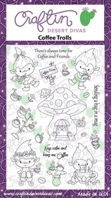
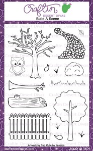
 I stamped out a scene using CDDs Coffee Trolls stamp set, the long bow from the Doodled Frames stamp set and Build a Scene scenery stamp set to show case these colors. Then I used each of the three color combination (plus one more) to color the whole scene.


I like to use the lightest tone (E13) first over the whole image so I can see how the scene will play out. Then I use the shadow tones (E09) over the whole scene, the mid tones (E17), and finally blend everything out with my original light tone (E13).


I repeated the same steps with the orange tones (YR02, YR24, YR27).


And finally, I finished off the card with the yellow tones (YR21, Y19, Y26). I may have gotten really excited about how the card was playing out, and forgotten to take the first two pictures for this coloring process. So above is just the first three colors laid down, and finally all three blended out.


The bonus color combination that I used in this scene is the flesh tone I used for the trolls. The truth is that this isn’t my color combination, but one I learned from Sandy Allnock when I started using copics. Alas, it is still one of my favorites and my go to combination when I am just quickly coloring (E51, BV00, and E21).


 I took all 9 markers from the yellows, oranges, and red browns, and added them to the ground cover in a pointillism style to create a leaf covered ground the blended in with the rest of the scene.


Finally, I took a bit of the YR21 marker and some colorless blender to drop in a touch of color into the background without add too much color. I just flicked a little yellow at the top and bottom of the sky, and blended it out with the colorless blender.
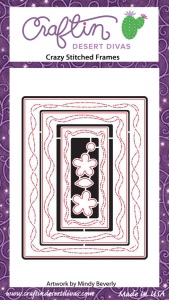
 I die cut the whole scene with the largest Crazy Stitched Frame Die and matted it out with some really dark purple card stock.

I hope you got a kick out of seeing one of my favorite color combinations for autumn. Please feel free to play with these colors, but just know that each color combination works differently in each hand. I tend to work pretty heavy handed, so I drop quite a bit of ink into the paper. If you work with a light hand, these colors will work differently for you.
But please play with them, and let us know what you think!

CDD Supplies