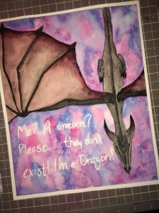
This post should have gone out yesterday, but it didn’t because I failed…no, I’m kidding, I was working. I have two new canvases going at the moment and frankly I got lost in the paint. I’ll show pics later of their  progress cause I am excited.
I also spent like four hours working on my Prismacolor colored pencil 9×12 spirit animal piece. Anyone who works with colored pencils know that kind of work takes FOREVER. Here is a sneak peak of the tiger I spent so much time on. I think he is finally taking shape, even though his tongue sucks right now.
But I do have some super cute cards to show you that I have been working on while the paint sets and the pencils are put away.
 The first card I have this morning is from Colour Q who have a great color palette this week with kraft, pool party, melon mamba, blushing bride and of course white. The colors felt so fresh and girly, I knew I had to do something sweet.
I pulled out a My Favorite Things Sassitude stamp pack and and stamped out the sassy girl image in Memento tuxedo black. I haven’t really touched

my Spectrum Noir alcohol markers in a while so I dug in and pulled colors that felt close to the challenge colors. Now I love this little stamp set, because this is exactly how my five year looks when she is at home, so I sort of tried to color her in a way that reminded me of my kid, minus the blonde hair, coloring it a ‘kraft’ color instead. I think she is sweet, and I know I missed the mark on the blushing bride, but what are you going to do. I added some glitter pink paper behind the image, and I pulled out a piece of kraft paper, but it it looked dull with just the image on it. So feeling daring, I pulled out an old pigment ink pad in light blue (it was a free pad with generic stamps pack from like five years ago, but it still works and I like the color). I pulled out the Inkadinkado Sketchy Flourishes stamp pack and repeatedly stamped the image in different directions. I like the subtle color. Finally I took the sentiment from the Sassitude stamp pack and stamped out the image in Archivial cobalt blue.
 Next we have another great color palate from Color Throwdown. I love color challenges because it allows me to do what ever I want image wise. And these colors are so not my normal reach for colors, I was excited. They were looking for aqua, orange and light grey.
I pulled out my Art Impression His and Hers Flying High stamp pack. I will have to admit, Art Impression are my favorite hands down stamps, because they are so detailed, and really inspire you to just sit and color when working with them. I don’t need an adult coloring book, just more Art Impressions. Now, the question to ask, is why did I work on

such a detailed card with just three colors, I will never know. Sticking to the challenge colors on this stamp set was a bit of challenge but I think it came out well. I used my Derwent watercolor pencils and my water brush, and think I was pretty successful. The dog however is my favorite part of the card. I did pull out my Distress salty ocean stamp pad and watercolored in the background. I like how uneven the sky was, but still uniform. This may be one of my favorite cards I have made in a while.
Now I get to go back to my workstation to pour more ink into my canvases. I love being excited about new work and right now I am really excited.

Both of your cards are adorable…such cute images and I love the happy dog on the CTD card!! You have used the colors beautifully!! Thanks so much for playing along with us at the Color Throwdown Challenge!!!
LikeLike
Such adorable cards, both of them. Thanks so much for playing along at ColourQ this week.
LikeLike
Your ballerina is so cute and I love the AI images!! Such fun cards!! Thanks so much for sharing with us at the Color Throwdown this week!
LikeLike
What a fun card using the CTD colors!!! I love that dog, LOL! Thanks for playing the Throwdown! Hope to see you again next time!
LikeLike