
 So it is the start of a new week (yes, my weeks start on Monday not Sunday). The kids are back in school after a full week off, the husband is at work, and the dog and I have some silence going on at the moment. I miss the kids, but I’ll be honest and admit that this silence is bliss.
The dog and I’ve had a walk, and I’ve done my work out. I started laundry, planned dinner, and run a vacuum, and somewhere in the near future is a shower, then some free time to work on a couple of on going art projects.
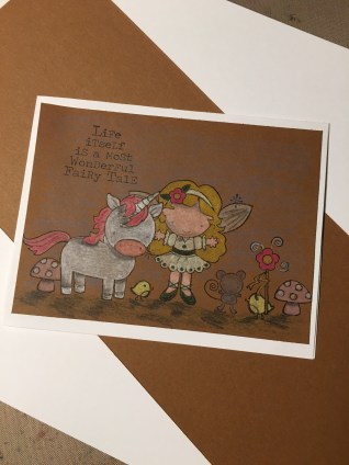
I like Mondays. They are a fresh start and a new chance. I like that I’ve moved this card challenge post to Mondays because it allows me start the week off with a great start. And boy, we have some cards today. I’ve been doing still the 30 day marker coloring challenge all month, and I feel that it has really helped not only my coloring, but my creativity as well. The unicorn and fairy image are a card I crafted this week for the coloring challenge with my color pencils on brown paper.
 Our first challenge today is from the sticklers of CAS over at Freshly Made Sketches. This week they are showcasing a very simple sketch that makes the designer really push their creativity to make an original card. I decided that I as going to use my coloring challenge with this card, hoping that the image would help my card start out of something a little different.
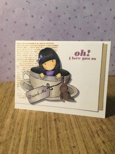
I pulled out a Gorjuss stamp and colored in the little tea cup girl with both my hand full of Copics and the rest with my Spectrum Noir alcohol markers. I really like how the shading came out, with the exception of how dark the inside of the tea cup came out. I added a background stamp from Bo Bunny with some Archival tree branch ink, and a sentiment in Memento. Then I simple assembled the card, adding dimensional tape to the tea cup image. I personally love how the brown stamp in the background gave the card a grungy look without making the card a grungy look.
 Up next we have a color challenge from the gurus of color over at Color Throwdown. This week they’ve given us the image of warm blankets to inspire us and the color challenge of red, gray, and white. Now, I’m officially done with cards about love, so this became a color combination that presented a bit of a challenge
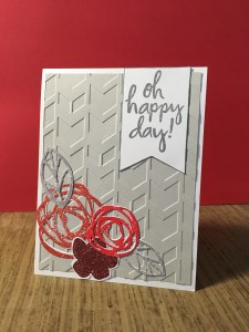
for me.
So instead of working about the color combination I started with the cable knit of the blankets and embossed a slip of grey card stock with a pattern that had a sweater knit feel to it. From there the idea of adding the layering of flowers in different shades of red became a realistic idea. I stamped out Ellen Hutson stamps and die cut them out laying the five pieces together. Finally I added a banner in white card stock with the sentiment to really highlight the white part of the challenge.
 Next we have another color challenge from the queens of color themselves, Colour Q. This week they’ve tossed us a wrench asking us to us nothing but basic black and white, plus one spot of color. Now I may have failed this week, but I did learn to us velum properly, so the week is a success for us.
For the challenge I pulled out a piece of black card stock and a sheet of printed white velum. I stamped out the

Stampendous flower and embossed in a brick red embossing powder the sentiment from the same stamp pack. Then I learned to properly adhere the velum without seeing the adhesive. I added some black and white dots (and of course the one with the red pop of color). Then I assembled the card. I failed when I added the white card stock with the spray of brick red shinny mica spray. But in the end I liked how it looked better, so I took the chance failing at the challenge.
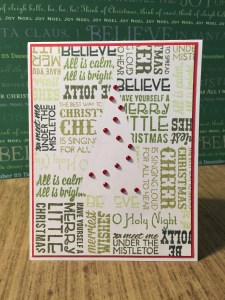
Finally we have a christmas card from the year round christmas challenge Jingle Belles. This week they challenged us to use TEXT in our cards. I decided to focus on my main image on being the use of negative space, and create my own pattern out of christmas text stamps. I cut out a tree from a piece of post-it-not, and started stamping the card with five different shades of Memento ink. I added the red gems to help pot the negative space tree, and matted the card with

a sheet of red paper. I love this card. I love that it worked exactly how I wanted it to. It is simple, and clean, and yet, because of the shades of green ink I used, still a little grungy.
That’s it for today. I hope your week looks as exciting as mine does, and hope you stop to make something today. Be selfish and create exactly how you feel like it. After all, you deserve to spoil your creative desire from time to time.

All lovely cards- seems you have been having some fun!! So glad you joined us at CTD!!
LikeLike
Cute cards! Your coloring is beautiful. Thanks for joining us at Freshly Made Sketches this week!
LikeLike
Wow, what great cards!! I’m so glad you could join us at the Color Throwdown this week!
LikeLike
What great cards and fun use of text and negative space … so glad you got texty with us at jingle belles.
LikeLike
so many cool cards! of course i’m bound to say the one you made for our “texty” prompt at JINGLE BELLES is my favorite… and truly, it’s a brilliant use of that fab paper! ♥
LikeLike