
Yes, I’m posting on Saturday morning instead of my normal Friday. I wish there was a good reason. There’s not. Except that it is March and the Madness is all about.
Yes, for those of you who picked up the subtle hint, I am a basketball fiend. I love me some college basketball, and right now there are games, games, and

games galore. And Sunday the tournament selection show happens. And next week we roll the ball out onto the court and the real fun begins. And since my team isn’t half bad this year, that makes it even more exciting.
So yesterday I pretended to paint, but what I really was doing was watching basketball. It was glorious. And now my kids are all old enough to understand that after the tournament is over, I go back to being a good mom instead of the crazy woman who yells at the television while jumping on the couch. They understand the madness is only temporary, and thus give me a pretty wide berth, asking their father for snacks instead of the woman who looks a lot like mom, but instead is a raving lunatic.
And you would think my basketball obsession would make the art go down hill, but the extra adrenaline and everything seems to only have help things. Or maybe not, and when I come back down to reality I will realize that I had on beer googles and it is all crap. I’ll let you know in April.
 Up first in our list of card challenges is our weekly dose of dessert with the designers over at Cupcake Inspirations who were baking up a color challenge this week. This week they are challenging us to whip up a card with the colors chartreuse, petal, goldenrod, and white.
Now, I don’t have a stamp color that is chartreuse, so I thought I would pull out some printed papers and paper

piece my colors this week instead of stamping or coloring the colors. I may have muted out the colors a little with the color selection I have picked, but I think all the colors of the different printed paper fell into the color ranges. I also pulled out my Tim Holtz crazy bird stamps and dies and started assembling two birds. The tall bird became my petal color with a gold beak, white eyes, and chartreuse wings, while the fat bird had the chartreuse body, gold beak, white eyes and pink itty bitty tiny wing. I love this stamp set and these guys just crack me up. I die cut a couple more piece of the three color and stamped out an Easter sentiment and layered them onto the stamp. To give the birds some depth, I pulled some brown foam and die cut it to match the birds they could have a sturdy underpinning that raised them up and gave them dimension. Finally I pulled out a gray Akashiya Sai watercolor pen brush and grounded them into the card with a bit of shadow.
I just love these guys. I know they are not normally an Easter image, but the colors sort of help angle them toward that feeling. I probably should have thrown in a basket or something, but I couldn’t bring myself to add anything else that might pull away from the birds.
 Up next we have a really fun technique challenge from the designers over at AAA Cards who’s theme this week is Embossing and Clean And Simple.
I decided to emboss with both an embossing folder and

embossing powder and see if I could make both embossing techniques work on the same card. I pulled out this faith and cross embossing folder from Darice and ran it through my die cutting machine over a piece of white card stock. Then I pulled out a little basket stamp from Poppy and embossed it using black pigment ink and clear embossing powder (I just can’t make my black embossing powder work without making a huge mess, so I cheat it). I pulled out my Akashiya Sai watercolor brush pens and added just hints of color to the basket and some grass to ground the image.
I left the card at that, hoping there was beauty in the simplicity of it all. I like the idea of making an Easter card that celebrates both the faith and the tradition of it.
 This week over at Always Playing With Paper‘s The Challenge we have been given by the design team a really fun sketch. I however recked the whole thing by going too dark. I forgot my own rule with art. You can always go darker, but lighter is hard, so always start light and add dark.
I was trying to make a masculine love card. I put cards in

my kids lunch boxes a couple times a week, usually just to make them smile or laugh and let them know that I love them. They get a kick out of it, and since i put post it tape inside the card with my message on it, the kids (especially the girls) often give the cards to their friends to keep. (I know, they are sweet.) Well I’ve run low on boy cards for my son (cause lets admit it is so much easier to make girly cards) so I thought this design was perfect for him and a masculine card. I pulled out my black Brusho and tried to make a dark back ground with it (I went too dark). Then to add insult to everything I pulled this really dark blue card stock out that matched the blue tones in the card, but make the card too dark. I did die cut out the hearts in both the dark blue card stock and white card stock and layered them slightly off center of each other. Finally I embossed the “I love you more” sentiment. I like the idea, but the card really is too dark. I think I will have to remake the idea and see if I can get it where I want it to go.
 The gurus of color over at Color Throwdown have set us up with a color challenge this week that they wanted to say summer, but I feel really said fall. I think it was all the orange. For me orange always says fall theme. (I think that is cause of pumpkins).
But I really wanted my card to say spring/summer so I
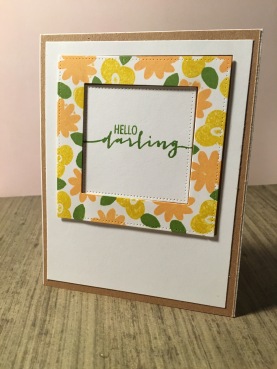
pulled out a stamp set from Avery Elle with lots of florals on it and pulled out some ink. For the orange color I pulled out Archival Ink’s Venetian Orange and for the green I used Archival Ink leaf green. I don’t have any typical yellow dye ink so I had to use Distress Ink’s mustard seed. I then die cut two My Favorite Things squares. Then the big square I inked two floral stamps and one leaf stamp. I added some craft paper behind the white card stock. I stamped a sentiment in the leaf green onto the small square and adhered the bid piece of card stock and the small square flat. Then the floral stamp piece of square I added some dimensional tape behind it to raise it up and give it a little bit of special to it.
I love this card. It is very unlike me, but yet so crisp and clean. And I think the colors work very nicely and softly to create a nice spring color scheme.
 Last this week, but certainly not least is a CAS sketch challenge from the design team over at Freshly Made Sketches. This was a simple sketch, but the potential for creativeness was totally there.
I decided I wanted to play off the idea of the strip on the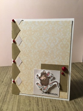 left side, without make an actually strip. So I pulled out a diamond pattern waffer die from Crafty Cutt Dies and cut out some brown pattern paper and cream pattern paper. I also die cut two squares from the same paper. I pulled out sheet of beige card stock and placed it on the bottom of my card and layered the printed paper into the design of the sketch. Finally the card was boring with just the paper, so I pulled out this cute little jumping mouse from Stampendous House Mouse series and colored him in with my colored pencils. I added a simple sentiment as so from Stampendous and added the mouse with some foam dots. In the end the card needed a punch of color so I added the sticky dimensional dots and left the rest alone.
That’s it for today. I am off to watch some basketball (no, I’m not kidding.) We have dip and chips to feast on today, and I think that is one of the reasons the kids are being tolerant with my basketball watching. The good news is the husband will be curled up with me all weekend watching ball, so it will be the perfect weekend.
Have a great weekend yourself and skip the crafting, and watch ball instead :).

Hahaha, your funky birds totally crack me up! I think you did a fabulous job paper piecing those guys!!! I don’t have anything Chartreuse either, so no worries! Thanks for playing with us over at Cupcake Inspirations!
LikeLike
What a great collection of cards, EK … fun, beautiful, dramatic, pretty and cute … in that order! Thanks so much for playing along with us at The Challenge! Anita 🙂
LikeLike
EK, you are always so busy! Your card look fantastic! Love the dramatic background for your card at The Challenge! So happy you joined us! XX
LikeLike
Loving the detailed hearts against the dramatic, black background of your card! Thanks for playing along with us at The Challenge!
LikeLike
Love your floral frame using the throwdown colors! I’m a huge college basketball (and football) fan and sadly, my Hoos didn’t make the win over NC last night! I have a small TV in my stamp room so I can kill two birds with one stone as well! Thanks so much for joining us at Color Throwdown!
LikeLiked by 1 person
I loved looking at all of your cards – they are wonderful! Thanks for sharing one at FMS!
LikeLike
Beautiful cards! I love that little mouse – too cute! Thanks so much for joining us at Freshly Made Sketches.
LikeLike
Fun cards!! Love the floral frame for CTD!! Thanks for playing with us!
LikeLike
Your cards are so fun and sweet! I love how you gave us the story for each one! Thanks so much for playing along with us at the Color Throwdown! AND thanks for joining us at The Challenge this week too!
LikeLiked by 1 person