
It is Veterans Day here in America, and it seems like a fitting end to what has been sort of a  crazy emotional week. However, for me, no matter what is happening here in my country, I have chosen to stay quiet and make pretty things. I am not quiet because I don’t have an opinion, but because I believe that for respect for others my opinions will remain my own.
So this week I have quietly sat at my desk and made pretty things. Things that make me feel better at the ugly things people are saying and doing everywhere. And this is one of the reasons I love art so much. Because for me, when my hands are in the art, there is simply peace. When my finger tips drip with paint, I am quiet. When I hold my marker and blend those colors,  my mind is still.
So I choose to do something that could make the world just a little bit  prettier this week, even if it is only inside the walls of my own house.
But today is a day of celebration regardless of where you stand politically. Today is a day to celebrate those individuals who choose to stand guard so the rest of us can pursue the American Dream. So for all the Veterans in my life (and you know who you are), thank you for taking up the mantel of protection that so few 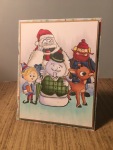 choose to take. And finally for our friends who have died serving this great country, you are never forgotten, and tonight we lift a beer in your memory.
Now for the pretty cards that have brought me peace this week. And I will warn you, it is beginning to look a lot like Christmas.
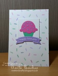
 Up first in today’s list of challenges (which I warn you will be long) is a great the theme challenge from the gals over at The Paper Players. I love that they have chosen to do a blessing/thankful theme design this week. And I am absolutely loving the colors within
 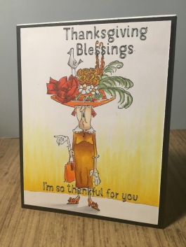 the photo.
I did not choose to go sentimental or sweet with my design however. I felt a need to be both thankful and snarky. So I pulled out a great Art Impressions stamp and colored her in using my copics trying to recreate the colors in the photo. I colored in the back ground wall, and got a little disappointed that it came out so streaky. Regardless, I think the coloring came out pretty well. I pulled out some sentiments from Hero Arts and stamped them out, and highlighted the words with a white gel pen. I backed the focal image with some black paper and left the card highlighting just the coloring and the fun of it.
 The little elves of design over at 52 Christmas Card Throwdown this week passed out a really fun sketch challenge, and knew instantly what I was going to do with the design.
I wanted to play with my colored pencils on some black card stock. 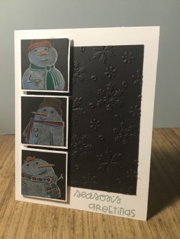 I absolutely love how colored pencils show up on dark card stock and thought this sketch would be perfect for this king of play. I pulled out some black card stock and trimmed it up, then ran it through my big shot inside a Darice embossing folder that had cute snowflakes. I then trimmed up three other small squares of black card stock and stamped out three different Paper Smooches snowmen in white ink. I colored the images in with the pencils and loved how they came out. The are so soft and whimsical. I stamped out a sentiment from the same stamp pack and called it a day.
This week the design team over at Less Is More gave out a CAS challenge featuring the 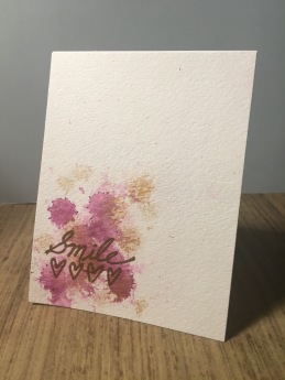 color purple and gold. I did not want my design to feel mardi gras, so I tried to go in a very strange direction.
I pulled out both a purple Liquitex ink and dropped it onto some watercolor paper individually. I sprayed the purple with some water and dabbed off the water and excess ink. I then did the exact same thing with gold Liquitex ink. I pulled out a Fiscars sentiment stamp pack and stamped out a large ‘smile’ and some hearts in versmark ink and heat embossed the sentiment with gold embossing powder. I left the card at just that.
I am not certain I like the design. I feel that it needs more, an embellishment or something. However, I am trying to learn the difficult art of clean and simple, so I left the design at just that.
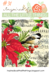 This week the designers over at Inspired by All the Little Things gave us a beautiful wintery bird themed inspiration photo to inspire us this week. Ironically, i just got a beautiful Stampendous bird holiday stamp, so BAM…that works out well for me.
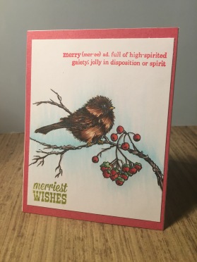
I stamped out the stamp on some white cardstock and colored the image in with my copics trying to make the little birdie look like it just shock off a drip o snow. I backed the image with red printed card stock and stamped out two different sentiments in both red and green ink. I keep (so unlike me) the card just that simple, letting the coloring speak for itself. I love how my little birdie came out. He may be just a hint too brown, needing just a bit more dark greys to really ground those feather, but I got at least almost what I wanted.
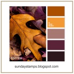 The group over at Sunday Stamps presented us with a beautiful fall color challenge. They inspired us to pick three different shades they present us with, and design something from there.
I pulled out a Art Impression stamp set, and using my distress 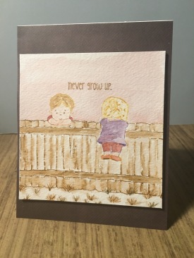 markers and some watecolor paper, stamped out the image, masking where I needed to sot he fence would line up with the images of the boy and girl. I softened the lines with my waterbrush, giving the whole image a soft look. I know I should have gone with bolder colors to be more true to the inspiration photo, but I love how the image came out none the less. I backed the watercolor paper with a sheet of dark printed paper, and assembled everything. I know the colors are too light, but I don’t card. I love how sweet this card came out.
Finally today we have a great sweet treat inspiration from Muse Card Club. This week Anita Bowden inspired all of us with a bit of an ice cream design. And I totally felt the need to go with that bit of decadence.
I pulled out some ice cream stamps from Your Next Stamp and started to stamping out the single dip with three shades of Spectrum 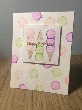 Aqua markers and then taking my water brush and filling in the image. On a different piece of watercolor paper I added the coned triple dip with the same markers and softened those lines as well. I stamped out a sentiment in some brown ink and then die cup the image out with a My Favorite Things Dienamic die. I snagged my glitter gel pen and added some sprinkles all over the ice creams
  hoping to give a bit of interest the entire card. I think I picked the wrong colors when I stamped out the card, but you know me. I don’t do things twice, or redo something because it isn’t perfect. I do know a little girl who will love getting this card regardless of the colors I used in it.
That’s all for today. I am off with my family (who is off of school and work today) to celebrate the veterans we know. I hope you are finding peace in your long holiday weekend and are able to still your mind and make something pretty.

You’ve made some absolutely wonderful cards here. What I really love is how your style is so varied – you’re always trying new approaches and layouts, and it keeps your work really fresh and interesting to look at. All the cards are fab, and I especially like your Less is More card for our purple and gold challenge with that gorgeously soft “splotchy” background and scripty gold sentiment. Perfectly Clean and Simple and very stylish too. Thanks so much for joining us this week!
LikeLike
What a lovely gallery of “pretty things”. I particularly love your watercolored creations, and the thanksgiving card is a hoot! What a fun image. Thanks so much for playing along with us this week at The Paper Players, and thank you also for your kind words to our veterans.
LikeLike
You have been busy and wonderfully creative this week! Love the rich variety of designs that you have share with us. Your Less is More design is perfectly CAS – the soft inky splotches provide a great backdrop for your gold embossing. Thank you for sharing with us 🙂
LikeLike
Beautiful projects! I love the little boy and girl peeking over the fence, perfect sentiment. Great use of the colors too! Thanks for joining us at Sunday Stamps, hope to see you again soon!
LikeLike
Very fun cards!
LikeLike
Such an amazing amount of creativity! It is fantastic to see a wide variety of styles, themes and colours such as you have given us here. I am in love with that loose splotchy background on the card that you have created for us at Less is More; it looks beautiful. Thank you so much for playing along with us. xx
LikeLike
Wow! You’ve been on a roll with all your lovely cards. I do like the Thanksgiving one!!! However, it’s the lovely pencil coloured snow folk that I’m commenting on. I do like the embossed panel and the snowmen are lovely. Thanks so much for playing along with 52CCT this week! Deborah, DT.
PS – I did email you, please contact me at dfrings@runbox.com – thanks.
LikeLike
Your art work and cards are wonderful. I came to comment on your sweet birthday card and was pleasantly inspired by all of your creations. Thank you 🙂
LikeLike
So many lovely cards. Your ice cream card is so cute. Love it and love the colors.
LikeLike
Oh I do love looking at your gorgeous cards!
LikeLike
What a great collection of cards, all so different and creative! I particularly love your your pretty ice cream card – so beautifully coloured and those soft shades remind me of the Neapolitan ice cream I used to love as a child!
LikeLike
Love the gorgeous watercolours – wonderful! So glad you joined us at Muse this week!
LikeLike
cute ice-cream cones birthday card
LikeLike
Love your watercoloured icecreams, such a fun design and I don’t think you chose the wrong colours at all…I see strawberry, blackcurrent and pistachio….sounds delicious to me!
Thanks so much for playing along at Muse this week, Anita x
LikeLike
Lovely collection of cards, you have been quite busy!
I really like how you softened up the SS colors. Your watercoloring looks great!
Thank you for playing along with us at Sunday Stamps!
LikeLike