
So it is another Friday morning, and here I sit in a quiet house with a cup a coffee and a handful of challenge cards. It is one of those Friday mornings for which you spend the week waiting. That’s cause it has been a long week. A very long week. And there is only one reason for that…
Next Tuesday I launch the year long (24 weeks) Art program at my children’s school. It has been a long (but seriously not long enough) fast road to this point. For the past couple of months I have been developing a plan to teach a structured art program to around eight hundred children. And last night I trained my volunteers. It has been a long road. It has been not nearly enough time. There has been amazing support along the way. I am not quite done with everything yet, but I am, and we are so ready to launch. The program is ready to go.
Here is the funny part of this. I’m not a teacher. I have zero actual art training (for those of you who don’t know I am self taught). And yet, due to increasing decreases in school funding, there is no art education (or at very least, very little). So here we go. The start of a program that will allow every student in that school over 8 hours of art education over an eight week period. If you pray, send a little strength my way as I go forward to enlighten little minds into the beautiful world of line, form, value, and composition.
The funny part of all of this, is the fact that the more I work on the early education art program, the more I want to work on my own stuff. I find myself sitting down for ten minutes to work on a challenge card. I find myself staying up thirty minutes longer to get just a bit more paint onto a canvas. Prepping this work has recommitted my own desire to create.
And I wonder…who is really reaping the benefits of this program? Some days, I pretty sure it is me.
 I am so happy that this challenge is back after a summer break. I always get a quick out of their inspiration photos. The design team over at Inspired by All the Little Things always come up with the best photos to inspire us to create. This week the graphic black and white wall clearly is meant to be a strong force with in the card.

I am still on a snarky card kick, so I pulled out the sentiment, a great Riley Funny Bones stamp first, and found the image second. I like how this Art Impression Stamp a) has wine, and b) has a gal wearing a headband like she was exercising or something. I think it works. I went sort of insane thinking I could add that black and white graphic stamp to the chair. I almost got it, but better hands than mine could have been more successful. I colored the rest of the image in with my copics, using the pink within the inspiration photo’s pillow. I found some (it might be Halloween) black and white striped card stock, and trimmed just a bit of pink paper to pul the pink tones. I probably shouldn’t like the way I did the wall/ground line within the image, but I do. I know it isn’t ‘right’, but I like it.
 Next up is a fun bright color challenge from Always Playing with Paper‘s The Challenge. This week they were looking for the colors teal, coral and yellow.
I wanted to do something bright. I didn’t want my colors to become

faded. I wanted them just as bold as the inspiration photo. So on a whim I pulled out my Distress Paints, and grabbed peacock feather, mustard seed, and abandoned coral. Then I simply pulled the paint over the card stock with my finger. I pulled out a Reflections stamp set and stamped out the feathers over the paint. I snagged a bit of color card stock and placed it under the focal image. I then pulled out some rhinestone ribbon and trimmed the whole thing up. I added the sentiment from the same stamp pack and called it a day. I love how bright the paint popped off the white paper.
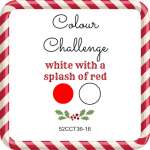 Next up we have a bit of holiday fun from the elves over at 52 Christmas Card Throwdown. This week they are looking for a white card with splash red.
I pulled out some white card stock and using a really old stamp,

stamped out a christmas sentiment in versamark and embossed it with white embossing powder. I pulled out a christmas Reflections stamp and stamped out the little tree and colored in the little ornaments with some R29. I smeared a little whipped Spackle under the tree and sprinkled some white glitter into it. The card for me was too white however, so i I added a strip of red card stock onto the side of the whole ![]() thing. I’m not certain I love this, but I do like it. And the whipped Spackle is a fun touch.
thing. I’m not certain I love this, but I do like it. And the whipped Spackle is a fun touch.
 The gals over at Sunday Stamps have a new challenge up this week and they are looking for some really bright colors.
So again using a snarky sentiments from Riley’s Funny Bones, I

thought this color palette would be perfect to convey both childhood strength and innocence. I stamped out a sweet little girl stamp from CC Designs and masked the stamp. Then using my Distress Inks, I blended candy apple, mustard seed, mowed lawn, chipped sapphire, and peacock feathers into a rainbow. I didn’t think the chip sapphire in the end looked like the shade of blue the challenge was asking for so I added a strip of blue paper to the side. Unfortunately, while I was adhere the card, I got an ink blob in the corner on the red. That is where the cute little
crystal came into play, so I could hide the mistake. I colored the little girl’s skin in with some copics and decided she looked so cute in black and white, that would leave it that way.
 I’ve found a fun new challenge this week that speaks to the snarky side of my paper crafting. The designers over at Naughty or Nice Challenge give you a choice to take their theme and be sweet or a not. Lets be honest. I will rarely be sweet. This week they are looking for a design that uses food or drink.
Again I have a new (to me) snarky stamp from Riley Funny Bones
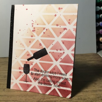
about drinking wine and thought it would be perfect for this challenge. I pulled out a Heidi Swapp stencil and blended aged mahogany and antique linen Distress Ink onto the card stock. I splattered some watered down aged mahogany onto the card to break up the blended ink. Then I stamped the sentiment and the shadow of the wine glass and bottle from a Paper Smooches stamp pack. I added a wink of stella over the wine shadow. It was only on chance that a splatter of ink looked like it was being poured into the glass. I added a piece of black glitter paper onto the side of everything to help ground the black in the card. I know this is not a super complicated card, but there is something elegant about it…well up until you read the sentiment.

I think all these cards are awesome! But since I’m here representing Naughty or Nice, I will say I _love_ the sentiment on that one! But also on your first card, too. I obviously need to add more Riley sentiments to my life. 😉 Thanks for joining us at Naughty or Nice Challenges!
LikeLike
Super cute!!! Thank you for joining us at Naughty or Nice, good luck!!! Amy DT
LikeLike
What a fab post! Good luck with your art programme, sounds amazing! Great cards too. So glad you’ve joined us at this month at Naughty or Nice Challenges, Jo x
LikeLike
Wow, these are all fabulous! Thanks for joining our food and drink theme at Naughty or Nice and the very best of luck with your art program 🙂
LikeLike
Quelle charmante simplicité, une adorable création, merci de jouer avec nous chez 52cct, biz
LikeLike
Your “queen” card is adorable! I love how you colored the background and left her black & white. Very striking! Thanks for joining Sunday Stamps this week.
LikeLike
I adore the sentiment! Being the Queen is more fun! Love the rainbow you created. SO happy you joined us at Sunday Stamps! XX
LikeLike
First of all, congratulations on the art program! That sounds like it’s really going to be awesome. Second, what a great bunch of cards! I’m a very sarcastic person so I’m loving those Riley sentiments. I think I’m going to have to look them up! You did a terrific job with the colors for Sunday Stamps, I love how you used them across the card!
Thanks for playing along with us at Sunday Stamps!
LikeLike