
So we are a week and a half into school. (YEAH) The kids are loving their new classes, their new teachers, and their hours back in the saddle of school. And, I am enjoying the few minutes of silence I am getting inside the house. However, with the beginning of the new school year is a beginning of so many new projects.
My husband has started a new project at work, which will cause him to be super busy for a while. He is always excited when he gets these new projects, so his focus has gone into hyper drive. The good news is the kids are just as excited (or mostly) for dad’s new project, as he is.
I have several new projects starting up, because like an overactive puppy who is easily 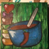 bored, I need stuff to do so I don’t become destructive. If I don’t overwhelm myself with work, I’ll start rearranging furniture, or throwing paint at anything that doesn’t move, and being an absolute nuisance to my entire family. So as the days of the new school year tumble one after another, I find myself excited for my new projects.
 Choir begins next week and I’ll get to do some more choreography this semester than last. It looks like our numbers of participant are going to swell a bit which is awesome, and at the same time terrifying. But the shows we will be working on will be cute, and hopefully we will manage to instill a life long love for the performing arts in one way or another into these pupils.
And then there is the art program we are launching at the school. We are using a pretty 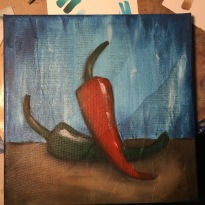 cool art program that was developed for schools that have had their art curriculum cut due to state education cuts. We are redefining the program a bit, and since I am at the helm, I spend my days and nights trying to iron out all the details. This is a bit stressful, but the opportunity to see my children and their peers have the opportunity to receive some real art eduction is amazing.
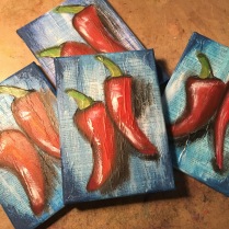
I have also been whipping up some art for our PTA for the back to school launch events. Last night we spent way too much time and way too much fun at our chili cook off and people seemed excited to win the little canvases. That always makes an ‘artist’ feel good.
But onto the bits of art for today…bits of card ‘art’.
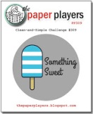 Up first in today’s line up of cards is a fun theme challenge from the gals over at The Paper Players. This week they are asking for a clean and simple (CAS) card featuring something sweet.
I pulled out a great little stamp pack from Your Next Stamp and proceeded to stamp out some ice cream cones. I wanted to do something a little
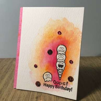
different from my normal work, so instead of coloring in the image, I watercolored in the negative space. I wanted some fun summer colors since we are on the cusp of summer weather stumbling into fall. Needed just a little pick me up with some beautiful colors. I pulled out my Prima Marking Tropics watercolors, and using just a bright pink, bright orange, and luscious yellow, I filled some of the negative space. I added some pink and orange sequins and a sentiment from the same stamp pack. I pulled a bit of orange and pink card stock and laid it under the watercolor card stock. Finally, using some Wink of Stella and glossy accents, I filled in the ice cream and cone. I don’t know if the color allows the card to be CAS, but I think this is the perfect card for someone’s (forgotten) birthday.
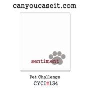 The sleuths of design over at Can You Case It this week have tossed out a fun them challenge. They are looking for designs featuring pets. How fun is that?
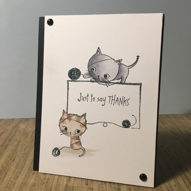
I pulled out an older stamp set for me from DoCrafts and stamped out the scene onto some card stock. Then using subtle coloring with my nuisance, I colored in the two kittens. I wanted everything to stay soft. I trimmed up the card, and laid it over some black card stock (off center on purpose). I added a few black enamel drops in the corners, trying to punch up the black within the image and card stock. Yes, the card is really simple….but I find that it striking.
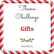 Changing gears just a bit, or at least time of year, the elves over at 52 Christmas Card Throwdown passed out a theme challenge asking for the festive presents of ‘gifts’.
I have had a stamp from CC Designs that I got on super clearance
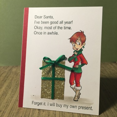
for a while now, and just haven’t had a chance to use it yet. No, the stamp has nothing to do with ‘gifts’ but it has everything to do with ugly christmas sweaters, which in itself is a gift. I colored in this gal (whose sweater really isn’t that ugly) with my nuisance markers. Now, I knew I wanted to put a pretty present in front of my focal image, but come to find out, I really don’t have any great gift stamps in my collection of holiday stamp packs. So, instead I pulled out some glittery paper and wrapped ![]() some pretty green ribbon around it to make it look like a nice holiday package. Finally, pulling out one of my favorite holiday stamps from Riley’s Funny Bones, I stamped out my sentiment. I added a bit of red card stock under everything, and called it a day. I should have added a bit of highlighting to the edges of the gift, but alas, I didn’t see the mistake till after I took the photo.
some pretty green ribbon around it to make it look like a nice holiday package. Finally, pulling out one of my favorite holiday stamps from Riley’s Funny Bones, I stamped out my sentiment. I added a bit of red card stock under everything, and called it a day. I should have added a bit of highlighting to the edges of the gift, but alas, I didn’t see the mistake till after I took the photo.
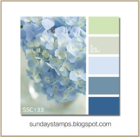 Finally today we have a really pretty color challenge from the designers over at Sunday Stamps. This week they are asking us to pick three of the five lovely shades of muted blue or green.
I needed a ‘thinking of you’ card for a friend, and I thought these colors would be perfect for that. I pulled out a stamp pack from Clearly Besotted, and stamped out the little hugging bears and the sun onto some watercolor card stock. Now, I made a huge mistake here…I did not
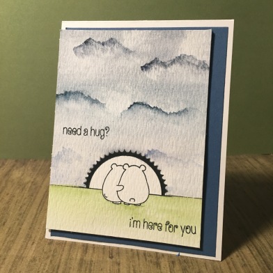
use water proof ink. No. I used the kind that would run with water being added…I just didn’t realize it until I added water. Oh well…I think I covered the mistake well enough. I again decided to pain in the negative space, instead of the focal image. I pulled out my Daniel Smith Besotted watercolors. Using three pretty shades of blue, I tried to do an ombre effect from dark at the high and light to the bottom. Adding a few darker areas trying to create clouds, I think I was able to create a nice stormy sky. I added a muted shade of green to the grass, and think I almost got the shade right. I stamp the sentiment onto the card, using the words from the stamp pack. Now, the sun had run badly, I pulled out a black pen and colored in the rays of the sun to correct my mistake, pulling focus I think to the bears in all the right ways. I added some pretty blue card stock und the watercolor paper, and left everything off center. I may have left thing too simple here, and something still seems off, but alas, that might just be the ink that ran that bothers me.
That is all for today. I am off to deal with some PTA stuff for the school and to see a man about a trumpet. Sadly (I hope the term will be happily in the end) the brass noise of a trumpet is about to enter our world. Till next time, find some time to make something pretty.

These are brilliant cards. I absolutely love the image and sentiment for the gifts theme! Super fun gift too. Thanks so much for playing along with our theme at 52CCT this week! Deborah, DT.
LikeLike
What great cards – love the watercolouring behind your ice cream – this would make a fun ‘belated’ card too. Good luck with the trumpet!!!!!! Thanks for playing along with us this week at The Paper Players!
LikeLike
I love your design, older stamp sets are the go to tools we pick in challenges like this! You’ve done it beautifully! Thanks for joining CYCI 🙂 Eva
LikeLike
EK…I love those kitties! Your card is simply beautiful! Thanks for playing with us at CYCI ~ Wynne
LikeLike
Those little kittens are such cuties. I always love your colouring and this one is no different. Just perfect!! Thanks for joining us at CYCI – Chlo x
LikeLike
EK, this is an adorable thank you card. Those kitties are so cute! I love the positioning of those kitties. Thanks for joining us at CYCI! Dawn
LikeLike
EK, lovely cards! The kitties are awesome and I love how the stamp creates a frame with the yarn. Thanks for playing along with Can You Case It? ~Pam, DT
LikeLike
Your pet card for the Can You Case It Challenge, OMG!!! So amazing! Thank you so much for playing along with us!!
LikeLike
Your sweet card for our colour challenge at Sunday Stamps is absolutley adorable! I love that the focal image is uncoloured and everything else is…such a cool look! Thanks so much for joining us this week.
LikeLike
All of your cards are great! I really like the card you made for Sunday Stamps, your mistakes don’t even look like mistakes to me. I love how the sky looks and your bears are perfectly highlighted!
Thanks for playing along with us at Sunday Stamps!
LikeLike
You’ve coloured the Christmas image beautifully. The sparkly present was a great idea, and what a great sentiment – such fun! Thanks for joining us at 52 Christmas Card Throwdown. Hugs, Gill xx
LikeLike