
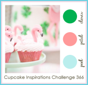
 It’s Sunday, which means we have an new challenge from your weekly dose of healthy sugar over at Cupcake Inspirations. This week we have a great color challenge for you all to sink your teeth into. We are asking for the colors pool, petal, and clover (or colors as close to this as you can).
This week our challenge is sponsored by Inspired by Stamping who is offering a $25 gift certificate to one random  participant. If that isn’t reason enough to get involved, maybe my two different takes on the challenge might inspire you.
 I was really stumped this week when designing this card. I think I was just in a funk. But seriously no matter what I did, I just wasn’t feeling it. The problem started with the fact that I just didn’t need to make a card for any specific reason, so I was working solely off the color challenge and a little bit with the photo.
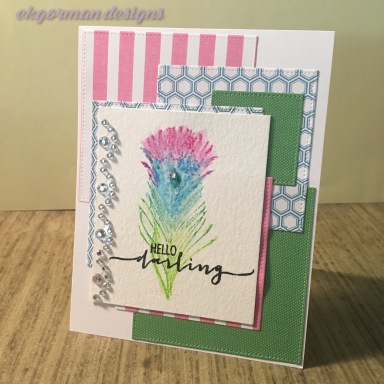
The first card I completed was cute, but for whatever reason, it just didn’t feel right. I pulled out a Deep Red stamp and colored the image with a green shade, pink shade and blue shade of Prima Marketing oil pastel, misted it with water, and stamped it onto some watercolor paper. I die cut out a bunch of printed paper with different sized square dies from My Favorite Things. I added a strip of crystals and one more little bling piece to the center of the feather. Again…I liked the card, and it was my son’s pick for my design team submission, but it just wasn’t setting right with me.
So I started over, and tried again. This time I pulled out a Stampendous stamp set and

stamped out the beach theme. Already, the serene beach theme felt better for me. I pulled out my copics and started coloring in the image. The chair was suppose to be more white, but alas, it ended up a little too gray. I purposely made the sand pinkish, so that the card could have that whole white sands feel to it. I stamped the umbrella out onto a separate piece of card stock, colored it and fussy cut it so that it could hang off the card in the end. I added a sentiment from the same stamp pack and put a bit of dimensional tape behind it so it would pop. I added a piece of pink printed paper and assembled everything. I don’t know what made this card settle as the one for me, but it did.
Let me know what you think, and which of the two cards you like better.

Both cards are wonderful buy I can see myself sitting in that beach chair enjoying a cold ice tea. It’s adorable and I love the soft coloring!!
LikeLike
Nope, can’t choose one over the other, as they’re both ever so pretty! Your multi-coloured feather, paired with the various MFT patterned papers, is quite striking. I agree with your son: it’s lovely! Your second: I’m with Birgit: that chair and the scenery you’ve created is an invitation to ‘come and sit a spell’! Gorgeous x two in my books!
~carol
LikeLike
Such a fun card and a lovely beach scene! DT teamie
LikeLike
Love this card! Makes me want to relax in the sun. Hope you have a great week!
-Sandy
LikeLike
I do know what you mean when you just don’t “feel” your card, but I think they’re both gorgeous! I don’t think I can pick one over the other…!
LikeLike
Such an inspiring cards. Not one but TWO cards! Awesome!
LikeLike
This is such a relaxing card! I so want to be sitting on that chair and watching the ocean! Love your work!
LikeLike