
We totally are about to hit a heat wave, and I am so not ready for one. Today was significantly warmer than it has been, and it was only the beginning. The whole weekend is suppose to be HOT, HOT, HOT…and I know San Diego isn’t the only place in the country, feeling the heat, so I’ll leave my complaining right there. I just don’t like the heat. (Trust me, I was a lot of fun when I was living in the Mojave Desert).
However, despite the rise in temperature, today was pretty cool. My neighborhood tries to  host a weekly activity for the kiddos to keep summer from taking over and killing all the adults. (later this summer I am giving an art lesson to all those little people ranging in age from 5 to 14…that should be interesting). But today there was a pet encounter. So we all got together let the kids swim for a while, then got to experience the animals. There were a couple of lizards, a ball python, a chinchilla and a skunk. Now I

can say, I’ve pet a skunk.
I poured (yes poured) a pretty cool little painting the other day. If you like mixed media and you have never tried Pebeo, it might be worth the effort and cost of a sample pack. It is always pretty fun to see what happens when you pour out the oil. You can’t control it, and you just don’t know what will happen till things dry. Yes there is a couple different types of acrylic mediums under the oil, which is what gives it the textured effect. I wish the picture really did the painting justice, but at least there is a sample of it.
My online Copic Jumpstart Class taught by the very talented colorist, Sandy Allnock, is wrapping up. I have a few more things to do before I “graduate”, but my lessons are done. 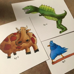 In our last lesson Sandy challenged us to color things that aren’t perfect. In short, she challenged us to color images drawn by children. So I of course had my three little kiddos (actually not so little seeing that they are 10, almost 8, and almost 6) draw me their favorite animal and I colored it in. I fear this may now become a thing….they thought it was awesome.
In terms of the little art, I’ve got a couple of neat cards to show you all, and one that totally jumped the rails.
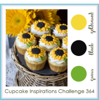 First up is a color challenge from our weekly dose of sugar and sweet by the bakers of design over at Cupcake Inspirations. This week they are challenging us to bake up a card using the colors grass, black and goldenrod.
This week I pulled a little stamp from Penny Black. This
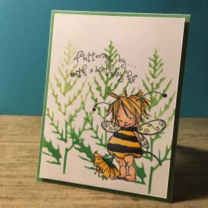
stamp pack is easily one of my favorites I own, and I reach for it a lot(as you will see). There is just something so charming about these little baby bugs. I colored the little bee in with my copics and laid a mask over it. Then, snagging a Crafters Companion stencil, I blended a couple different shades of green Distress Ink to create the back ground. I just love how the image looks like it is popping out from the back ground. I added a piece of green printed paper to the card, and added the image with a bit of dimensional tape. This will be one of my last cards for this groups challenge, but I will explain later why (it is not because this challenge group doesn’t rock…trust me they do.)
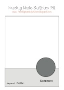 Up next we have a sketch challenge from the always clean and simply simple designers over at Freshly Made Sketches. The hostess of this weeks design talked about how she wanted to challenge herself to do a partial die cut. That wasn’t where I wanted to take the sketch, but decided to try a partial emboss.
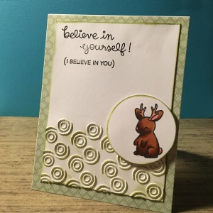
Pulling out an embossing folder from Darice, I embossed only the bottom half of a piece of white card stock. Using a bit of forrest moss Distress Ink and a blending tool, I highlighted the raised bits of the card stock. I pulled out a great little stamp set from Lawn Fawn, and stamped out the image and colored it in with my copics. Yes, I got the shadows too dark. But you know me, I take my mistakes and go with them. I die cut the image with a Little B circle die and added it to the embossed section with a bit of dimensional tape. I stamped out the sentiment from the stamp pack to the top the card stock. Finally, I pulled out some printed green paper, and layered the image on top of it. Yes, there are some mistakes in the coloring, but over all I like how the green plays with the image on a whole.
 The gurus of color over at Color Throwdown this week sent out an interesting color challenge. They wanted us to craft with the colors kraft, yellow and green. These are not colors I normally would reach to color with, so I found myself a little stumped.
But in the online class I’ve been taking, I explored a bunch of

different skin tones colors, and thought this might be the perfect time to break out some new skin tones. Again pulling the stamp set from Penny Black, I stamped out the little baby butterfly and colored her in with my copics. So I tried to color my little bugs skin tone in a kraft (ish) color, and I think I was pretty close. I hit a few shades of green in her wings, and a great butter yellow in her skirt and flower. I stamped out a sentiment from Dylusions in some tree branch Archival ink. I layered the card with a bit of embossed yellow card stock and a touch of kraft paper. Yes I left the card really simple, , but I really wanted to highlight the coloring in this card.
 So here is where I fell off the rails…this card really got away from me, but I am going to share it none the less. (Remember that one learns more from failures than they do from success). The designers over at The Mixed Media Card Challenge this month challenged us to create a mixed media card with the theme of ‘sunset’ and an optional theme of ‘postage stamp’.
I pulled out a bunch of ‘postage stamp’ ephemera from Tim Holtz
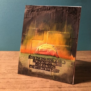
and adhered it to some mixed media paper (cut to A2 card size) with a bit of Tim Holtz vintage crazin. I added a layer of white gesso to the whole thing and wiped a bit away. I didn’t want to see the postage stamps, just their shapes under the paint. I added a horizon line, and a bunch of texture paste for the actual sun. With a bit of different colors of Distress Paint, I colored the card. The sun got several douses of Distress Stain in both a squeezed lemon and rusty hinge. The problems started about here, because at this point I realized it was suppose to be a sunset, not a rise, so I pulled out some black Tim Holtz crackle paste and added it the corners with it…and that became too dark. So I blended in some black soot Distress paint , rubbing it on and off until I got pretty much what you see. I tried adding some gelatos onto the image to bring back some of the colors, but that didn’t work as well as I had hoped. I added the sentiment from Dylusions, more for myself than anyone…these moments, the moments when it all becomes mud really are the moments I learn the most. I know where I jumped the rails here, I think I know next time how to keep it from being such a mess.
That’s it for today. I have a couple of fun announcement, so hold on, and you’ll get to hear them soon. Till then, enjoy your weekend, and learn something from the ugly you make.

Great designs! I love how you experimented with skin tones on your baby butterfly. Thanks for joining us for this week’s Color Throwdown!
LikeLike
Thanks for the tip on coloring the embossed background. Never thought of that.
LikeLike
All of your cards are just fab! The textured effect combined with that cute little image make this a wonderful card. Thanks for joining us at FMS this week!
LikeLike
I Loved your kids artwork! It is incredible for their ages! So Cute!
LikeLike
Thanks for joining the fun at the MMCC. I enjoyed reading your process – I can so relate! I think the dark bits add depth:) Love all your other cards too!
LikeLike
I’m diggin’ your sunset with all that texture! Thanks for joining us at the MMCC this month!
LikeLike
gorgeous card. love all the layers and texture!!! and the sentiment is perfect! thanks for playing along with us at MMCC 🙂
LikeLike
Oh my goodness! Such an adorable bee card!!! and you know, I think your kids got some serious talent just like their mama…their drawings are pretty amazing! Thanks for sharing with us over at Cupcake Inspirations!
LikeLike
Love the texture, very cool. Thanks for playing along at MMCC.
LikeLike
Your work is fabulous! Your children’s art is incredible! Oh, and they are little…you’ll realize that looking back on this some years from now! Honestly, I think their work would be marvelous for fabric design, too!
LikeLike