
Yeah, it is Friday. Anyone else as excited as me. Yeah, Friday!!! It has been a long week. And this weekend is so very busy, and yet lots of fun things are happening, so Yeah Weekend.
There is a very real chance I might even get to have a date with my husband. With three

kids and a crazy life, dates are not as frequent as they should be, so in the moments that I might just get one, well, needless to say I am excited.
Now, the question is; can I get all the paint off my hands and wrists so I look like a real grown up, instead of one who finger paints. I have been busy at the easel this week, and just can’t seem to get the ink and acrylic out from under my nails. I get this is why they make paint brushes, but seriously, paint brushes just can’t do what a finger tips can. Come to find out, while I was running this afternoon, I ran into an acquaintance and discovered I had red paint behind my left ear. Not even sure when I used red paint, but alas, there was red paint on my neck behind my ear. Such is the life right.
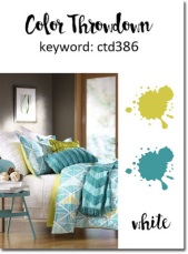 The first card in the line up on today’s Friday Card Challenge to is a color challenge from the gurus of color over at Color Throwdown. This week they had tossed out a strange color combination, that when you really think about it, is not strange at all, the colors lime green, teal and white. Seriously, these two
colors are really striking together.
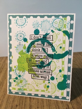
I went with something messy, for not other reason than I just had messy in me. I pulled out my fresh lime and vibrant turquoise Dylusions paint and dabbed it on through a Tim Holtz stencil. Then sticking to my ranger products, I stamped out some Distressed Ink in twisted citron and peacock feathers with two different Dylusions stamps. I added a sentiment from the Dylusions line just to be a little snarky, and backed the whole card with a piece of printed card stock.
This isn’t the most classic or classy card, but I don’t care. Sometimes you just need a little messy snark to get through the day.
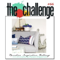 Up next in today’s line up of challenge pieces is a masculine inspiration photo from the designers over at Always Playing with Paper‘s The Challenge. This week, the inspiration photo has a nautical theme, and a masculine vibe.
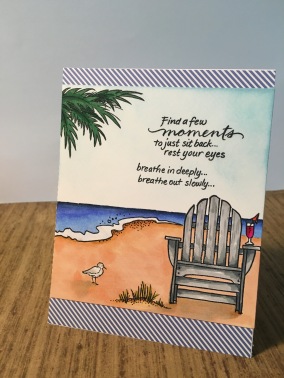
I have a void of nautical themed stamps unless they have pirates attached to them, but I do have a great little beach stamp set from Stampendous and decided this was going to work. I stamped out the beach chair and beach theme onto some card stock and colored it in with my alcohol markers. I biffed the sand coloring and am seriously going to have to learn how to color large areas in better, but that is neither here nor there right now. I added some tumbled glass distress ink with a blender into the sky so that that area was smooth. I added the sentiment from the same stamp pack and cropped the card. I added some diagonal deep blue printed paper and left it at that.
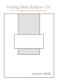 The designers over at Freshly Made Sketches tossed out a simple CAS sketch this week that made me really excited. The large rectangle shape was perfect place to use a stencil that I’ve been secretly plotting for a while.
I pulled out ____ stencil and some lemon zest and melted

chocolate Dylusions paint and blended it through leaving the honey comb impression behind. Then pulling out some kraft paper and a sheet of yellow printed paper with a subtle hexagon print on it and layered the card up. I saved a scrape of print paper and kraft and held onto them for the other rectangle in the sketch. I pulled out a stamp pack from Penny Black and stamped out this cute little bumble bee baby and colored her in using my colored pencils, leaving her skin uncolored so that the kraft could be seen through. I lastly stamped out the sentiment that says, ‘fluttering by with a birthday hi’ on the scrape pieces of paper and finished assembling the card. There is something so crisp for me in this card that I adore it. That, and I adore that cute little bee stamp.
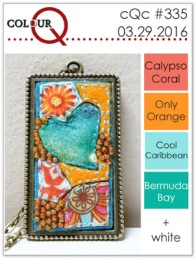 The queens of color over at Colour Q tossed out a bright color challenge this week. They asked us to assemble a card using the colors calypso coral, only orange, cool caribbean, bermuda bay, and white. This is an awfully bright order, and for me, these colors screamed frozen cocktails by the pool side. So cocktails just had to be in order.
I pulled a a cocktail stamp pack from Paper Smooches and
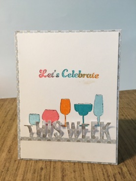
pulled out five different cocktail glasses and stamped them out onto the light straight pencil line I drew. I used four shades of Distress Ink to resembled the challenge colors, pulling out carved pumpkin, worn lipstick, tumbled glass and peacock feathers, stamping the light blue color twice on each end. Then using the orange, coral, and teal color I stamped all three out on a sentiment from the same stamp pack letting the colors blend a little. Finally using a die from My Favorite Things dinamics and die cut a piece of pale blue printed paper to give the allusion of a pool under the cocktails. Thus the whole card read, ‘Let’s Celebrate This Week’, and lets be honest, surviving some weeks just needs to be celebrated. I added the same piece of printed paper under the white card stock and left it at that. Now I somewhere along the line screwed up the card by smudging a bit of orange ink onto the card and boy did that stink. Oh, well, I will try to sand paper it out later before sending it to someone.

Finally today, we have a little bit of festive cheer with the designer duo over at Jingle Belles. This is one of those Christmas all year round challenge groups, and this week they were looking for a little bit of Santa within the card. Funny thing, however…I don’t have any santa stamps. Go figure.
So I stamped out some of Santa’s friends from a Stampendous stamp pack instead and an silhouette of Santa from an Inkadinkadoo stamp pack off in the distance in the sky with a bit of black ink. I colored in Santa’s friends with some alcohol ink markers and tried to blend distress ink into the back ground of the card. I went to ink the sides of the card stock with a black ink pad and biffed it, streaking black ink onto the card over an antler. Whoops. Now, this card took quite a bit of masking, and spend some actual time coloring in the characters so this whoops killed me. So I decided to just go with it and over inked all the card. Then I over inked the paper behind the card too. In the end, it worked. I like how it worked. I guess that is why we call it a ‘happy accident’.
That’s it for today, and now I am off to go prep for the weekend. I think my son has big plans on my playing a game of Pokemon with him, so that’s what is up first. Hope everyone out there has a great weekend lined up for them and maybe some special time set aside with someone they love. That, and carve in some time to do something crafty.

I love Santa’s trio of friends … and how you put him in the sky … so very glad you joined us at jingle belles.
LikeLike
What a great line-up of cards, you’ve been busy! I like your line up of tropical looking drinks. Thanks for joining us at ColourQ!
LikeLike
I adore your beach scene and that sentiment. So perfect! Thanks for playing The Challenge!
LikeLike
Fabulous cards! Love the glasses of cheer and your cas design! Thanks for joining us at ColourQ!
LikeLike
Fabulous lineup of cards!! Thanks for playing the Color Throwdown Challenge this week! Hope to see you again next time!
LikeLike
What a great collection of cards, EK … that being right sentiment just had me giggling … and I love the beach scene … such wise words to go with it! Thanks so much for playing along with us at The Challenge! Anita 🙂
LikeLike
I popped over from Freshly Made Sketches – LOVE the honeycomb background you created. So perfect behind that sweet little bee! Thank you for playing along with us at Freshly Made Sketches.
LikeLike
to tell the truth, i wouldn’t have known there was EVER an “oops” you did such a great job disguising it!!! (& i’m glad b/c YEAH there’s a LOT of amazing coloring there!) what a great card all round & a fab take on this prompt! thanks for celebrating the residents of the north pole with us this fortnight at JINGLE BELLES! ♥♥♥
LikeLike
Wow! Look at all the awesomeness! Thanks so much for joining us at the Color Throwdown and also at The Challenge!
LikeLike
Such a beautiful grouping of pretty colored glasses.
LikeLike